List It Fix It was conceived as an online, app-based solution for customers to consolidate all of their small hardware jobs into a list, and then connect them with an engineer to complete them all at once.
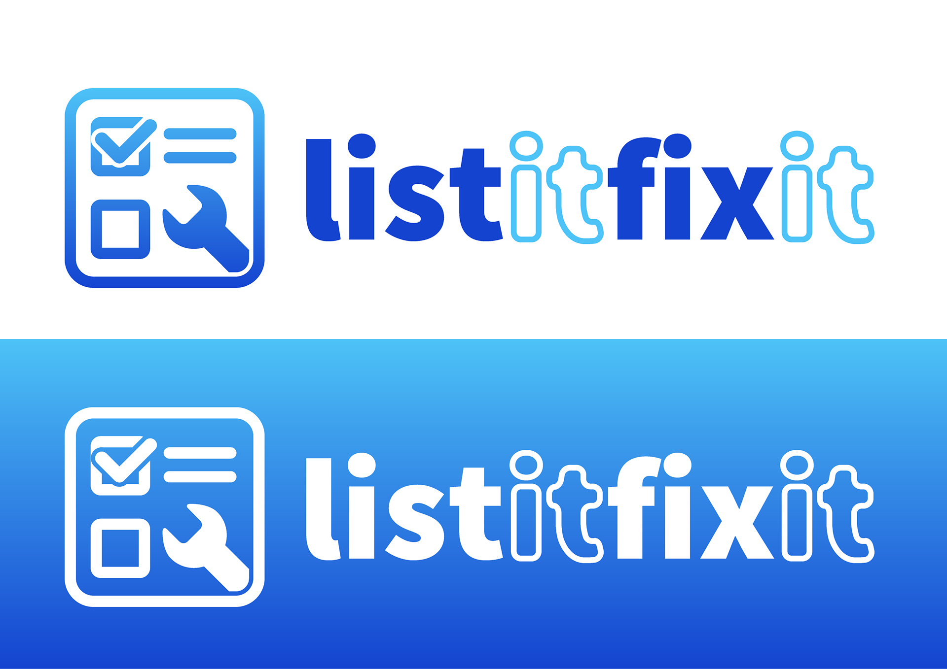
I started by designing the app icon first with the intent to build the brand around it. This approach helped to define the app icon as the most important part of the brand, as this would be the main point of interaction with customers.
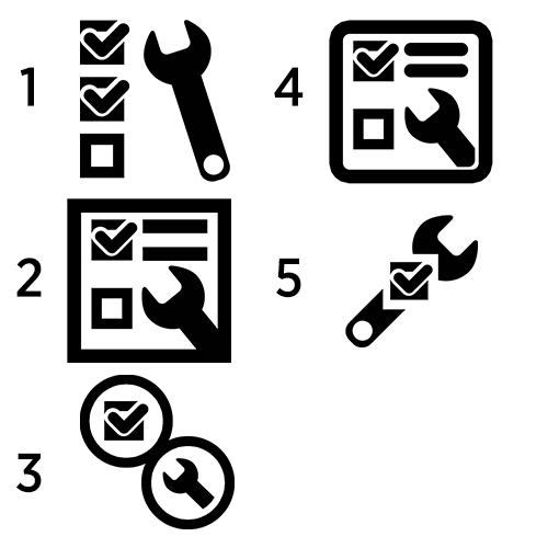
Initial design ideas for the logo.

Like the company name, I took a direct approach when designing the icon. Quite literally I wanted the icon to say the company name, hence a list (represented here by a checklist) and a spanner.
I decided on a soft blue with a subtle gradient. This was to make it distinctive enough to stand out while also evoking calm and sense of friendliness.
Paired with the utilitarian design, this created an icon that represented the company concept and ethos.
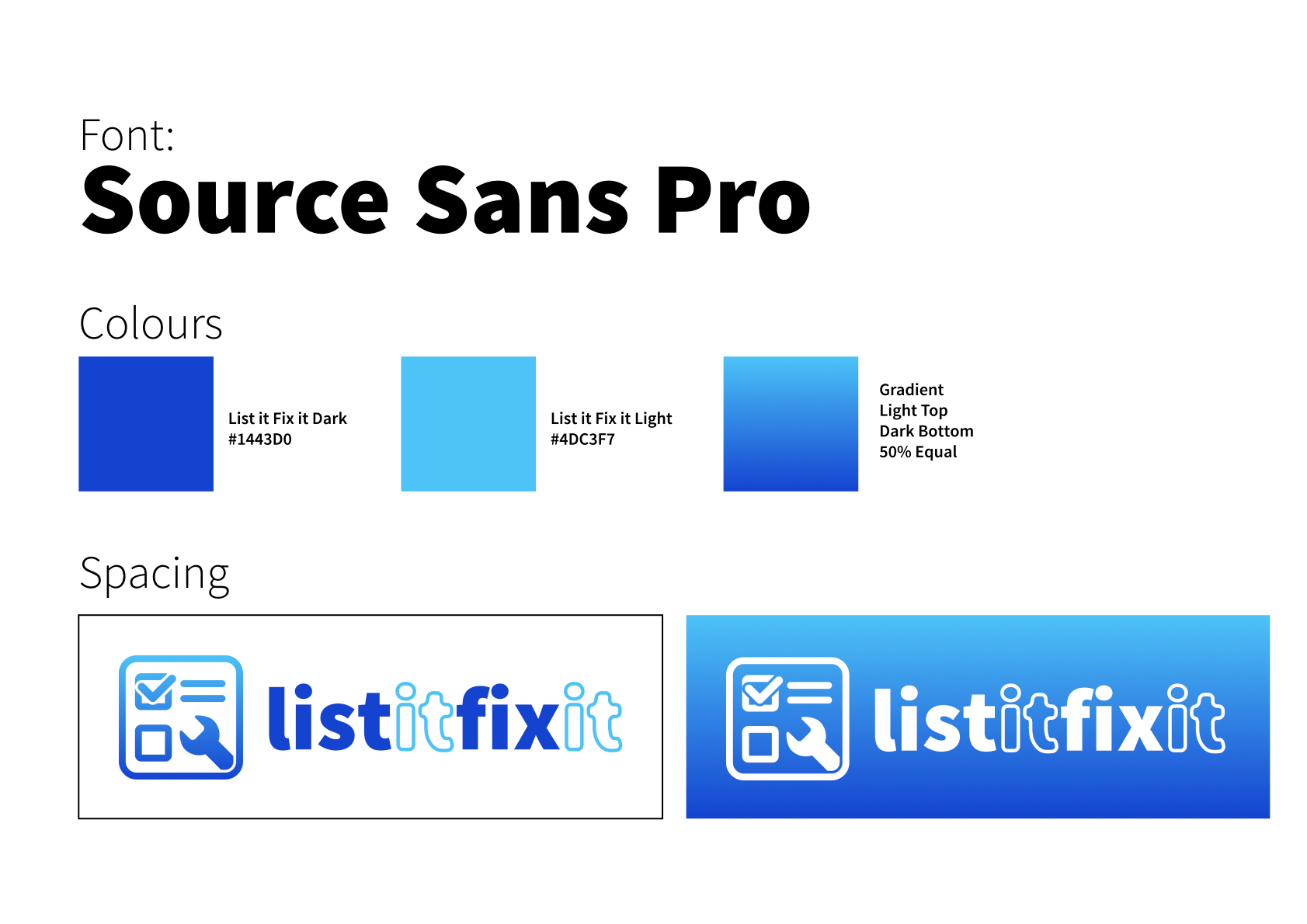
The font choice, Source Sans Pro, was chosen as it was not too sharp, and to be easily readable and friendly. The "It" parts of the logo text are in outline to help the viewer distinguish the wording in the text, and are slightly rounded to evoke that friendliness.


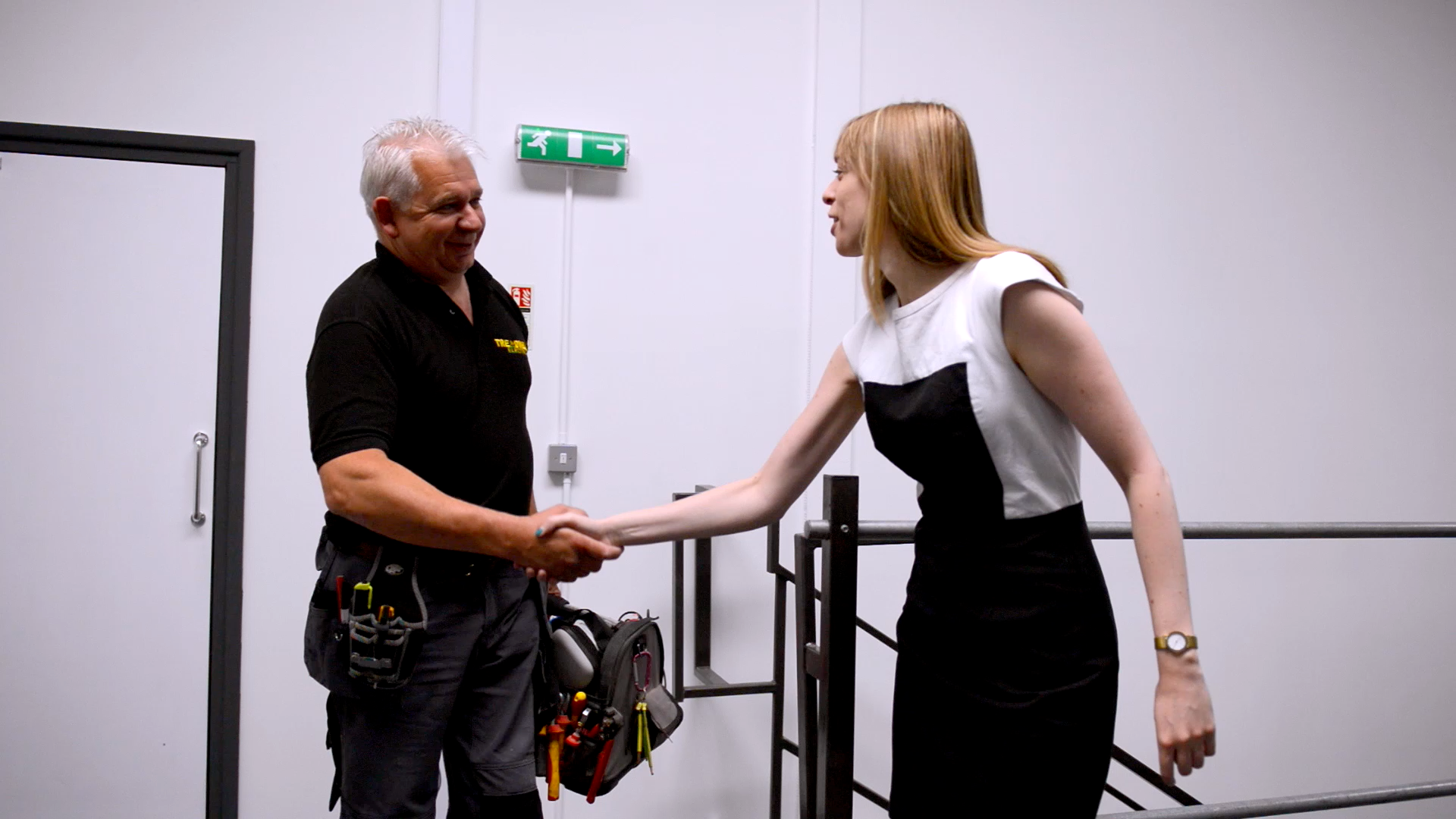

After producing the branding package, the company approached me again to create a short video demonstrating the company concept to their customers. I designed the sequence in collaboration with the client, sourced the acting talent, planned and directed the entire short.

I also fully post-produced the short. I animated the logo "drawing in" in order of its visual message (the list is first, then the spanner) to help reinforce the brand. I chose a light, friendly soundtrack to accompany the package.