I wanted to go with something more edgy so as to represent the grit of the films Kindling produced. I also wanted something unique that would stand out.
Essentially, I wanted it to be remembered and always associated with quality and films that were shown without compromise.
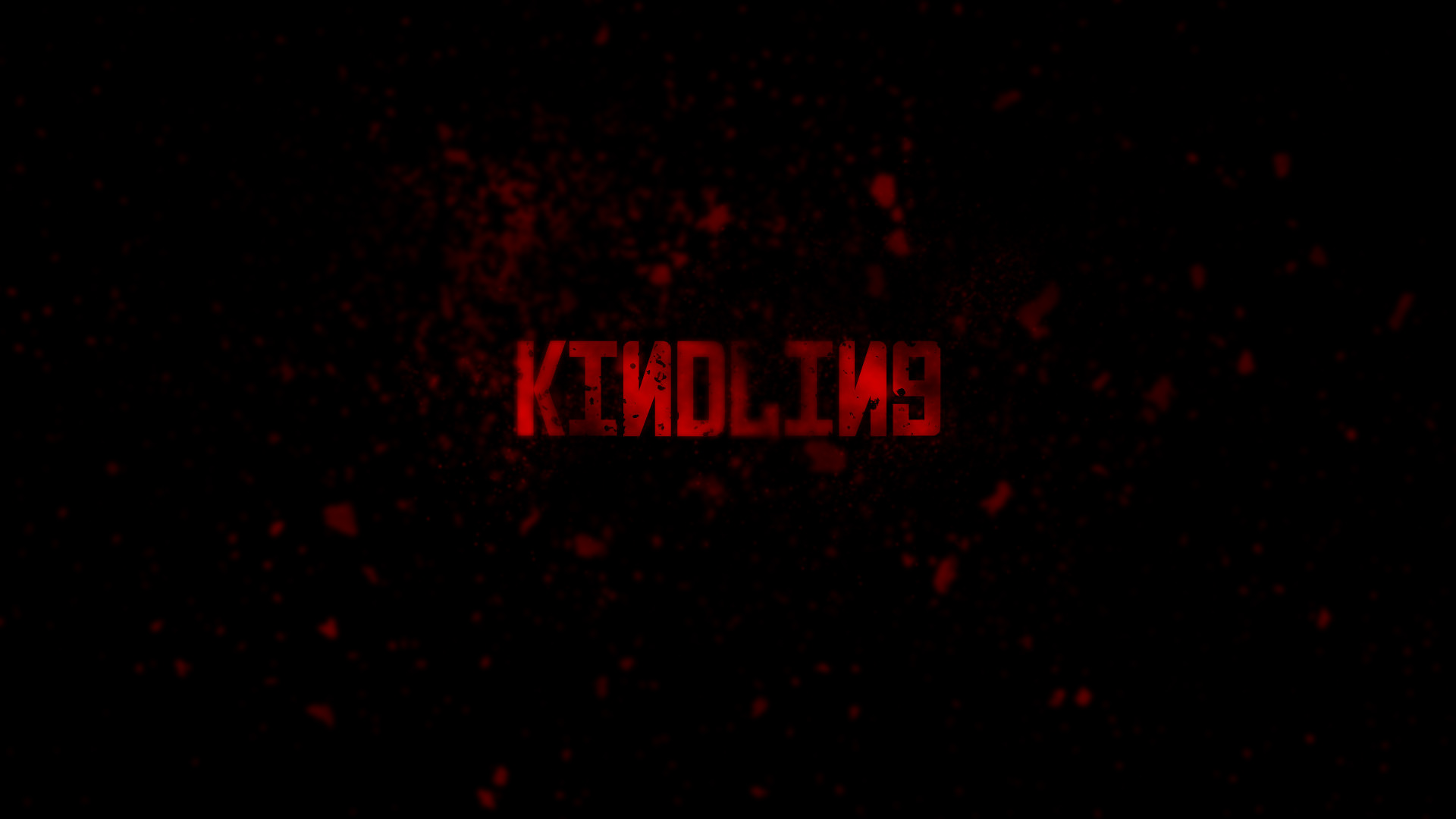
The original concept before the adjustments.
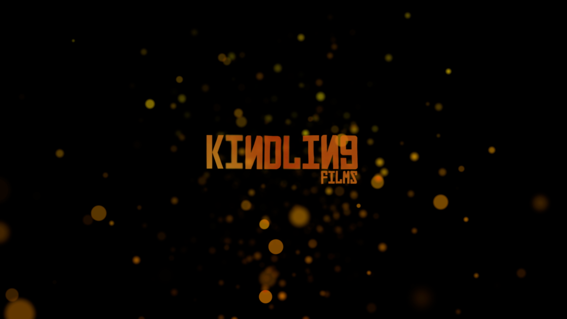
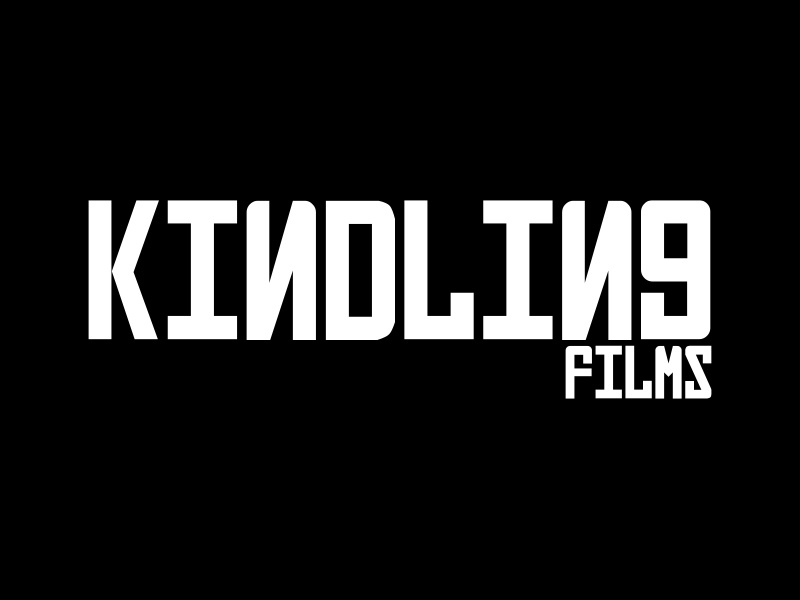
To that end, I used a bold, impactful Cyrillic-style font whilst reversing the ‘N’s. Initially, the letters were distorted by dirt and in red. This grit was removed and the colour switch to orange at the clients request.
I added a background of embers to represent the dying light of a fire, tying in with the brand's name.
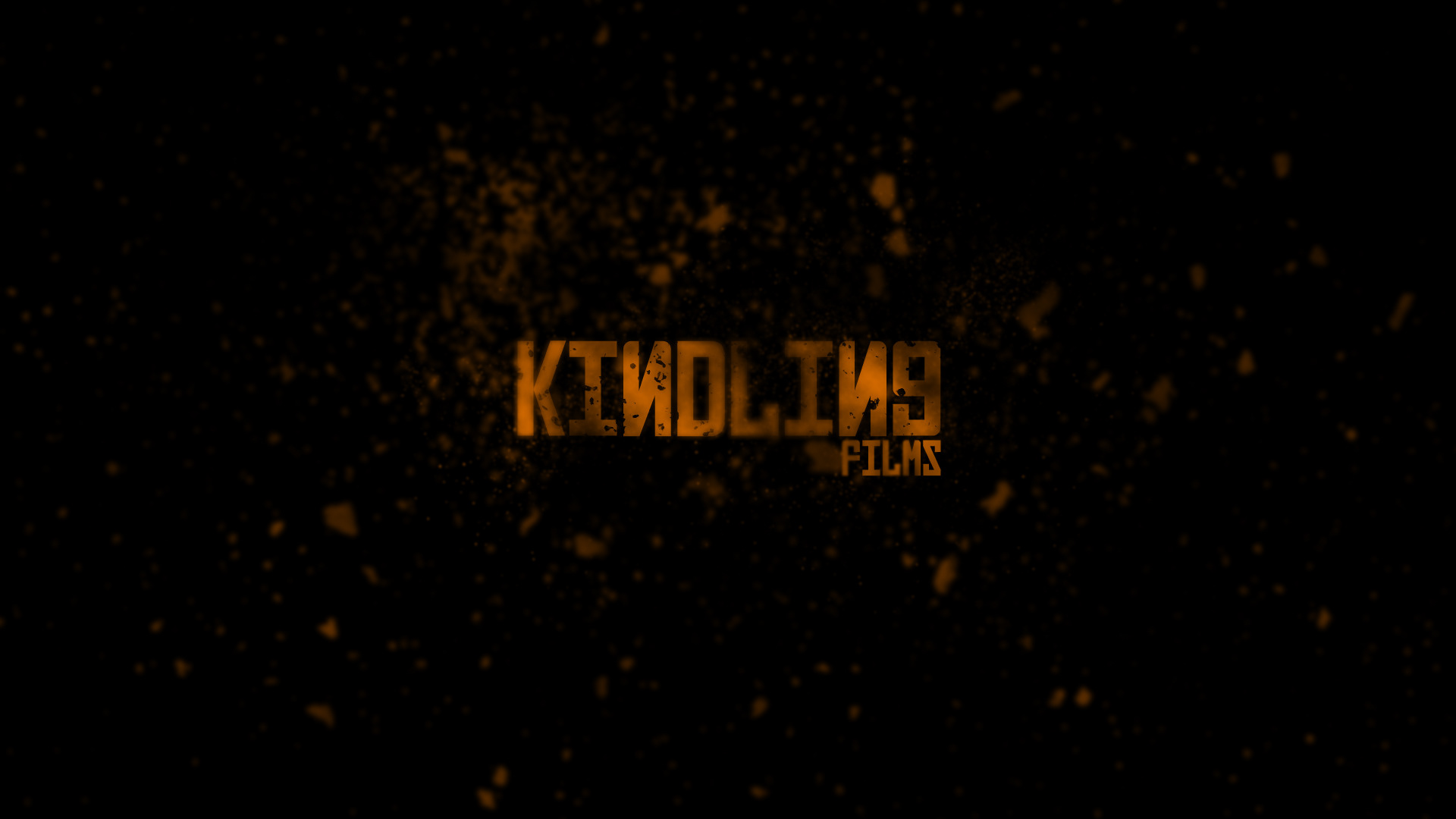
The finalised concept, now orange with the "Films" subtitle.
The reversed N’s became the defining part of the logo, and as such I felt that the natural next step would be to lead the animation with that.
The camera would be in shallow focus, and the logo itself would move away from the camera, come briefly into focus and then move out again.
I also added a heatwave effect as it passed through the embers which increased as the logo faded to black.
A video showing each creation and animation stage of the Kindling Films logo.
The final animated logo featured at the start of each Kindling Films production.