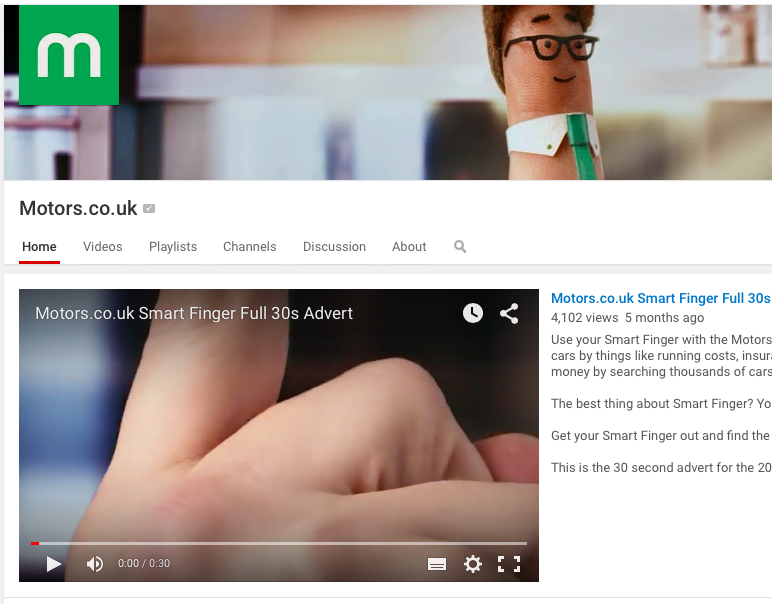
Following the success of the graphics package I designed for the client’s coverage of the Geneva Motor Show and in lieu of the YouTube channel’s restructuring effort, the client requested I extend this rebrand across all of their online output, as their then-current branding was basic, un-animated and lacked sophistication.
I introduced a new font (Avenir) and employed a motion-blurred masking effect akin to a car rushing by. I designed more sophisticated title screens, bringing the Motors.co.uk logo into prominence and integrating it into the title animation.
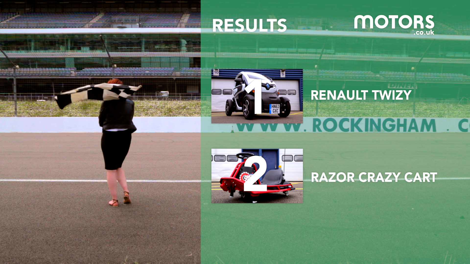
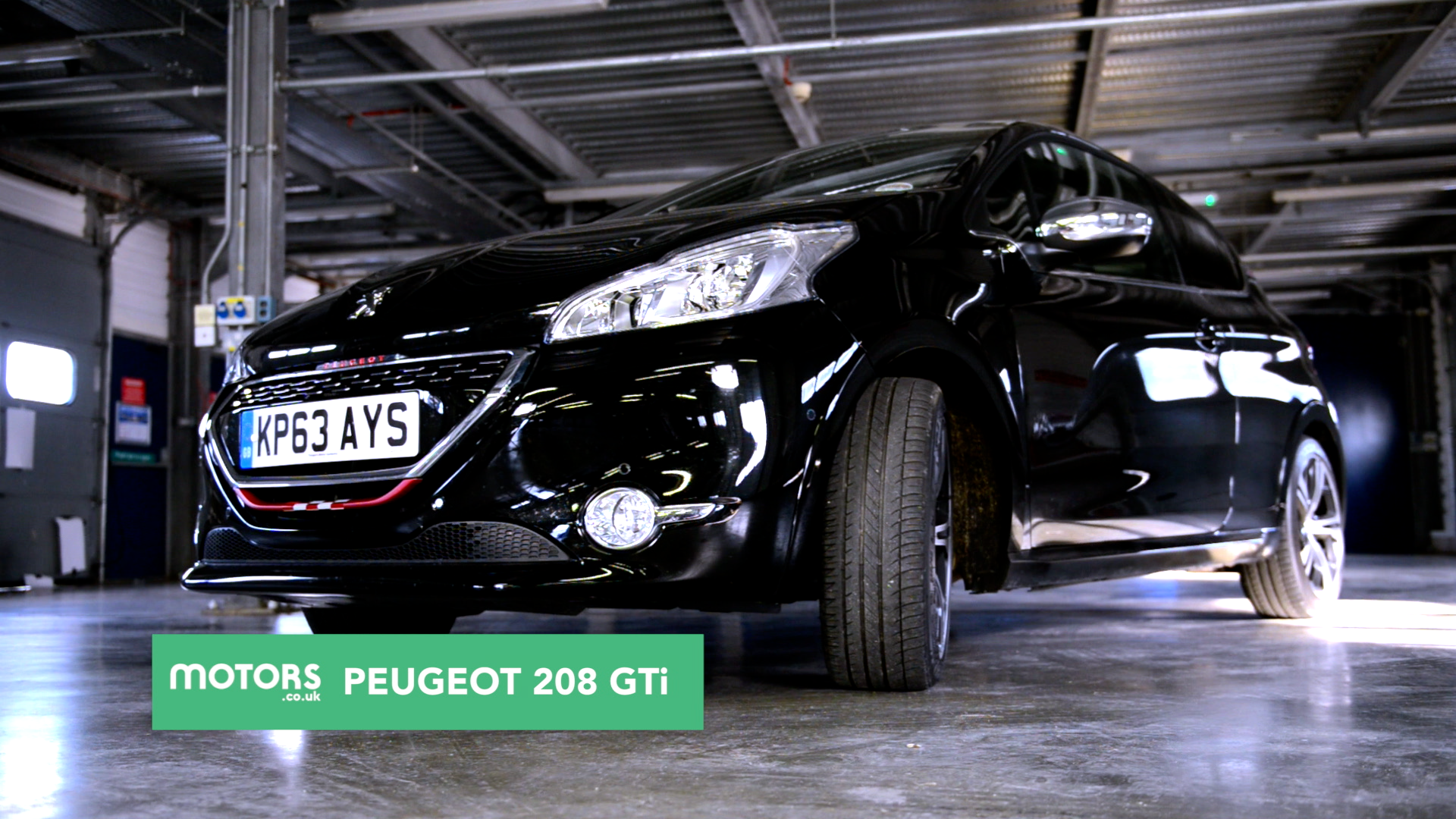
I also brought the series title into sharper relief by making it larger and in capital letters; this helped to differentiate it from the episode name, as in the previous branding the two were getting confused.

A special version of the ending title card with a cinematic 2.35:1 frame.
Further animations, such as lower thirds popups (with the presenter or interviewee names) followed the same masked sliding technique and more prominent usage of the client’s logo and colour scheme.
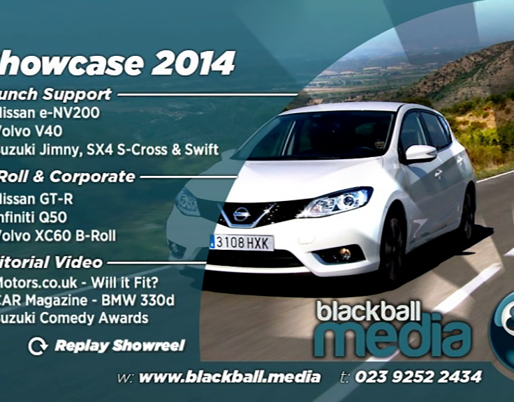
I designed and produced a more sophisticated ending card, incorporating overlaid footage from the video it followed.