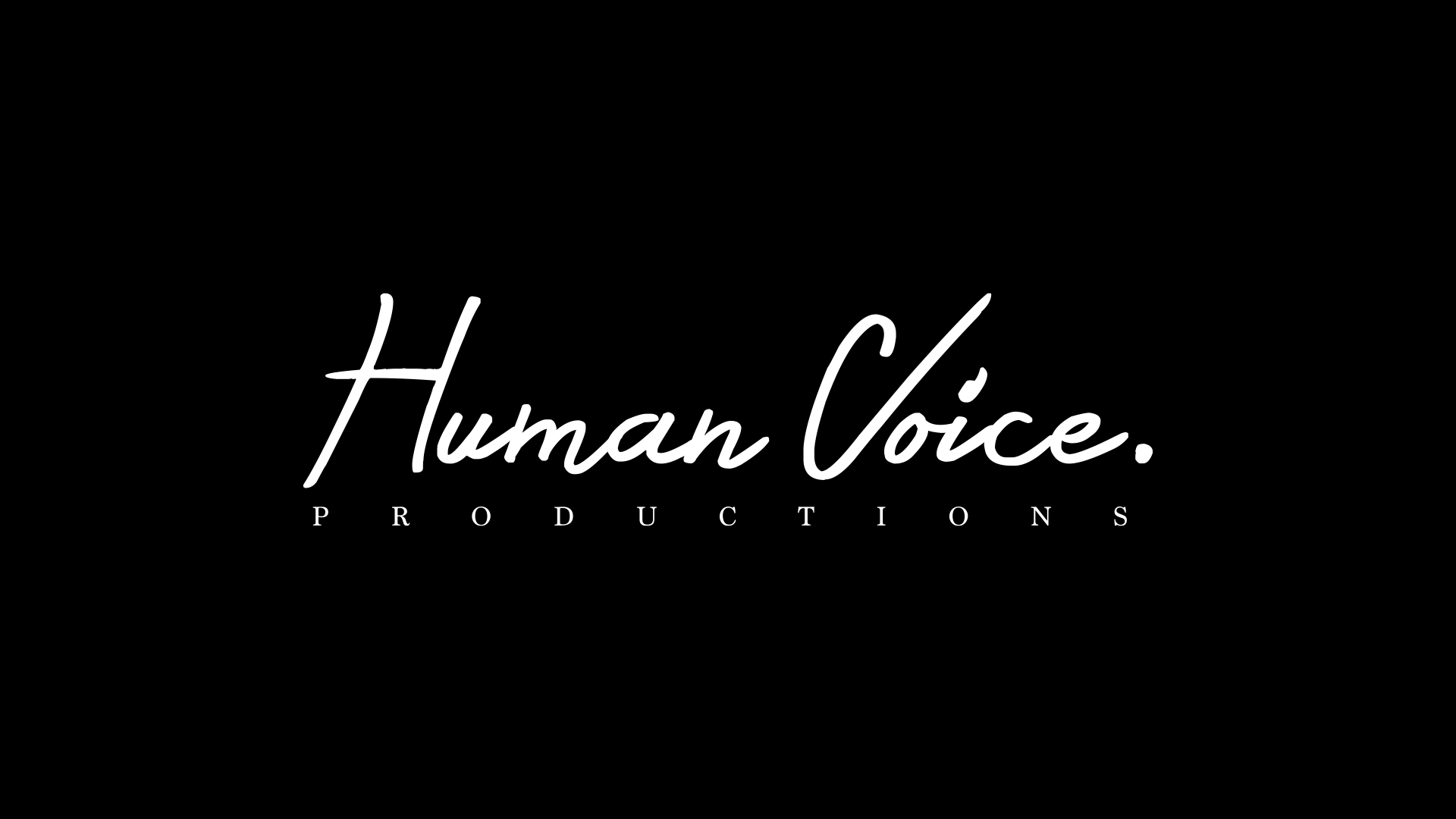
I thought it important to maximise the human quality of this production group, as their films intend to explore the human spirit and depth of human emotions.
This led me to a handwritten logo as opposed to a typeset one. It was important to use a friendly, easy-to-read type in an effort to enable people to relate to it in some way. ‘Productions’ was added in a serif font as a tribute to the underlying the seriousness of the films.
The logo was animated as if writing on a piece of paper; I wanted to keep it as simple as possible so not to detract from each short films’ individual character.