I am privileged to be a part of a small and ambitious independent film production company. We have produced four short films, each gaining places in film festivals and earning acclaim. During production of our second short, we decided we needed something to call ourselves.
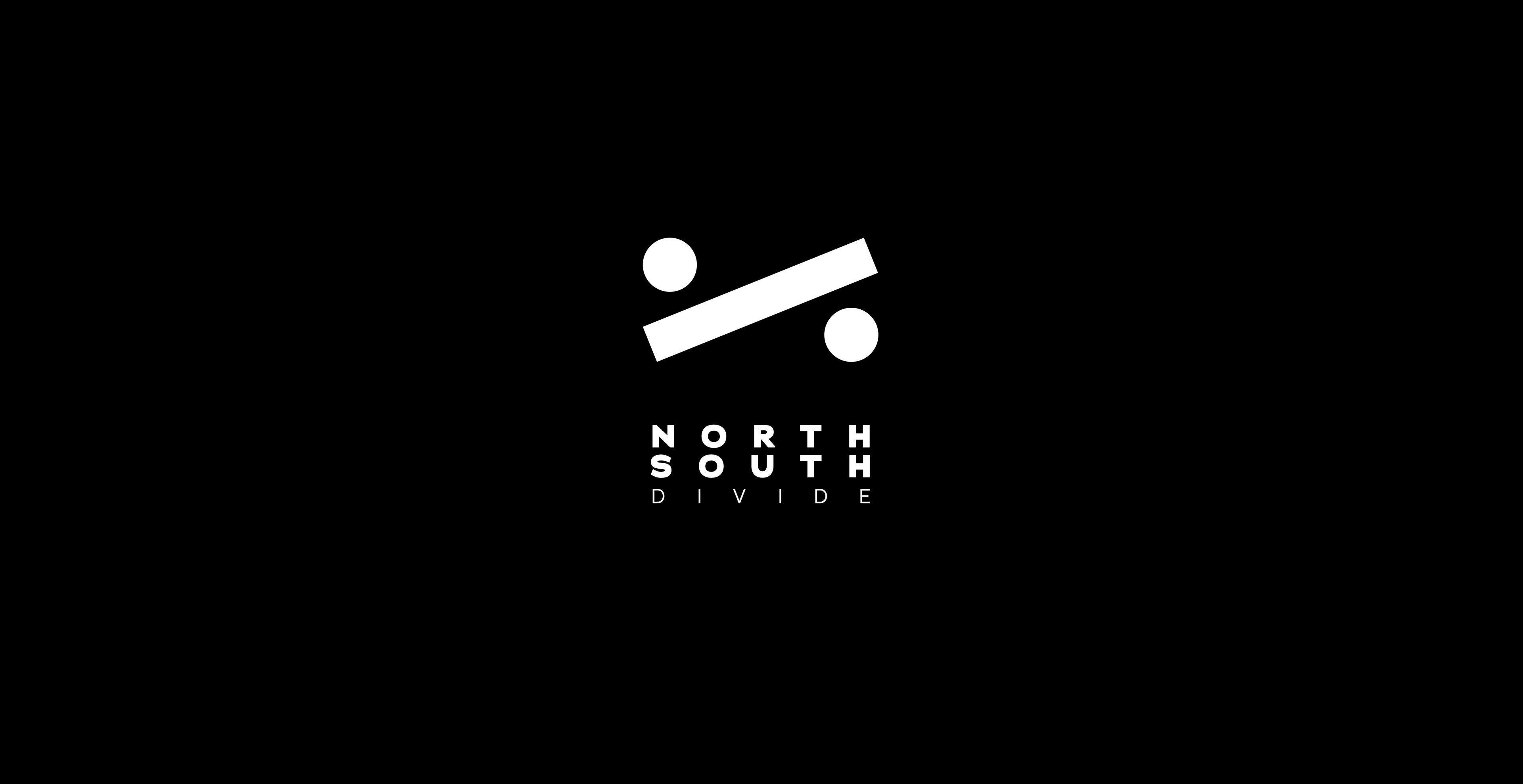
The name "North/South Divide" came up in an on-set discussion, and it turned out was a name we really resonated with.
It represented the dynamics of our small group (with one from the north of England and three from the south) and was reflective of the kind of short films we produced.
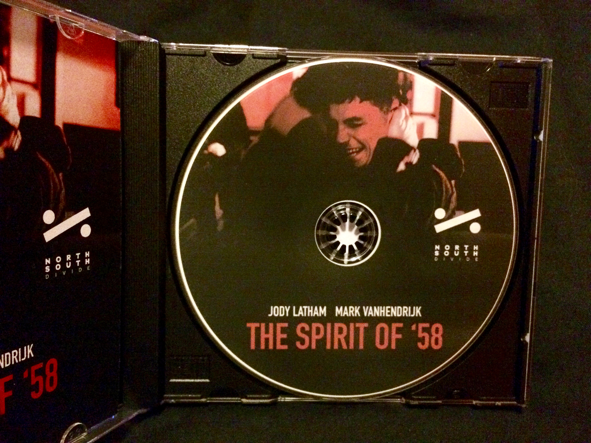
The logo in use on a production Blue Ray Disc of The Spirit of 58.
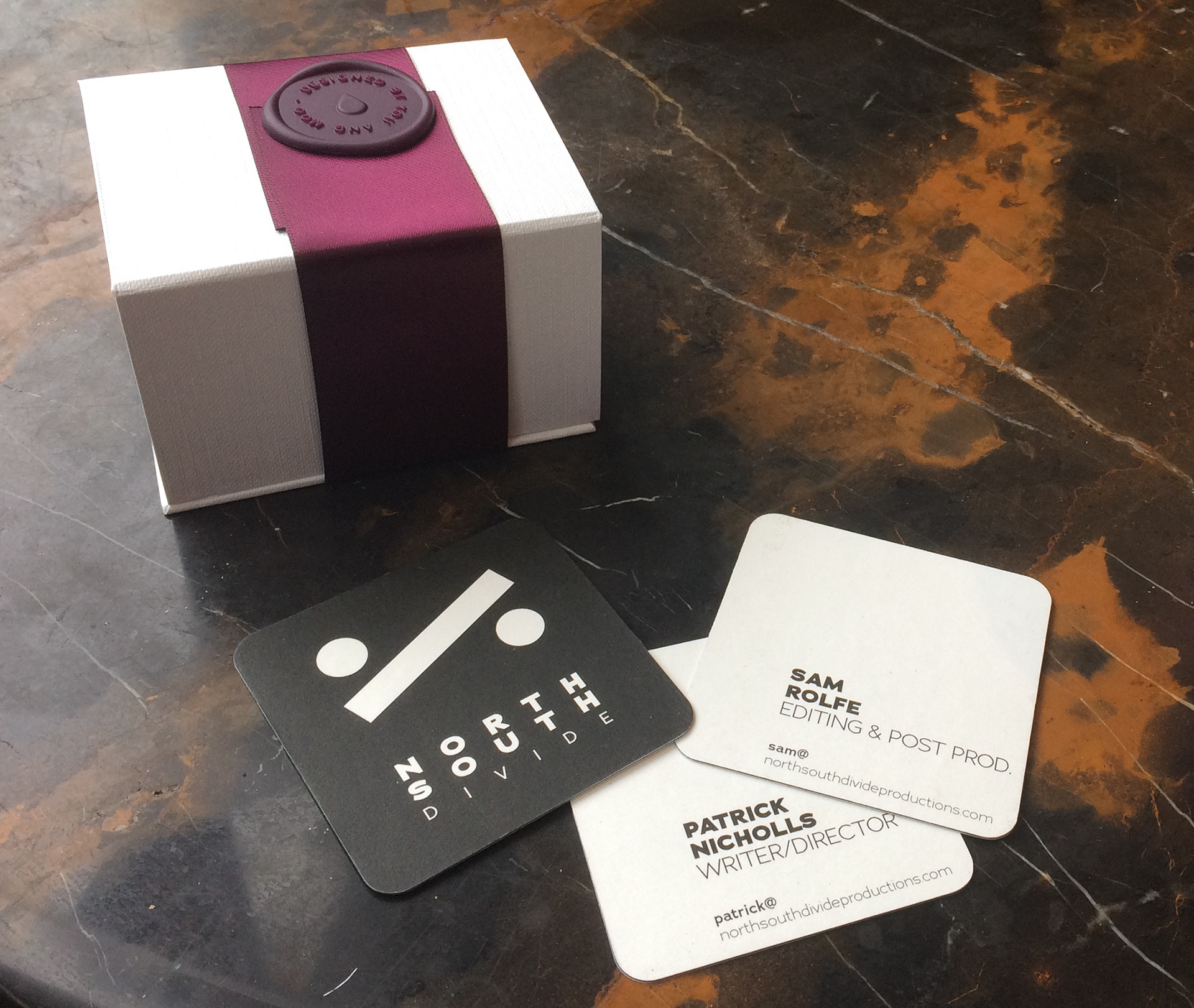
The business card design. I designed them to be deliberately unconventional and eye-catching, while at the same time bold and simple.
The logo design represents several elements. I made it a division sign, to literally represent "divide". I rearranged it to represent the relative positions of Manchester and London, the two cities our team were primarily from.
The circles in the logo also represent people, divided by a thick line. This could represent many things, such as finances, race or religion. This was reflective of the content themes we produced.
The logo is deliberately silent, and is designed to have the lead-in audio from the film while playing. This is help associate the logo with our production and production style. The animation is simple, short and smooth.