It is always exciting to design something for a brand new company, and it was a great opportunity to build something from the ground up.
The client was aiming to create corporate videos, so I decided to pursue a utilitarian approach. We needed the logo to be bold, distinctive, flexible and simple, and inform the rest of the brand.
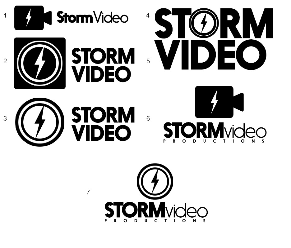
Initial design ideas for the logo under the company's originally planned name.
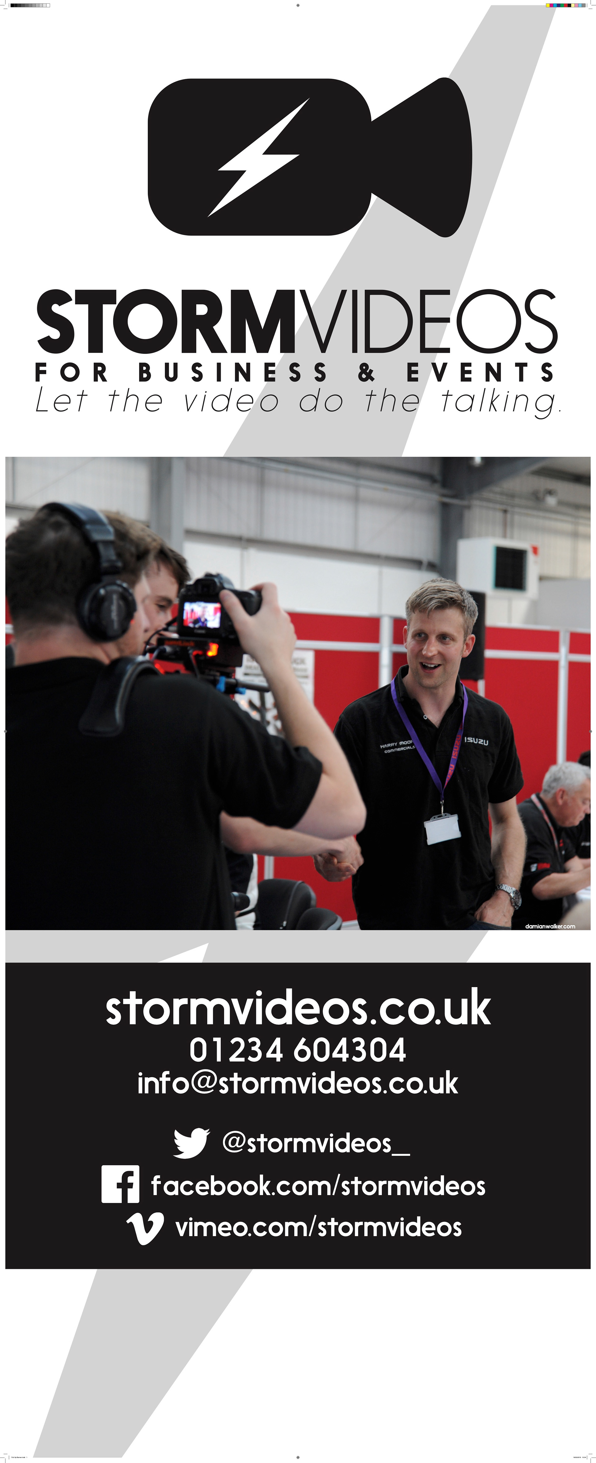
The design we settled on quite literally interpreted the company's name into its logo, with a camera marked with a distinctive lightning bold. It was designed to work on its own without text for use in social media and still be recognisable.
The branding design followed the same principles of boldness and simplicity, primarily using black and white as its colours. This was to convey the senses of utilitarianism and practicality; this company literally lets the video do the talking, hence the brand was simple and straightforward.

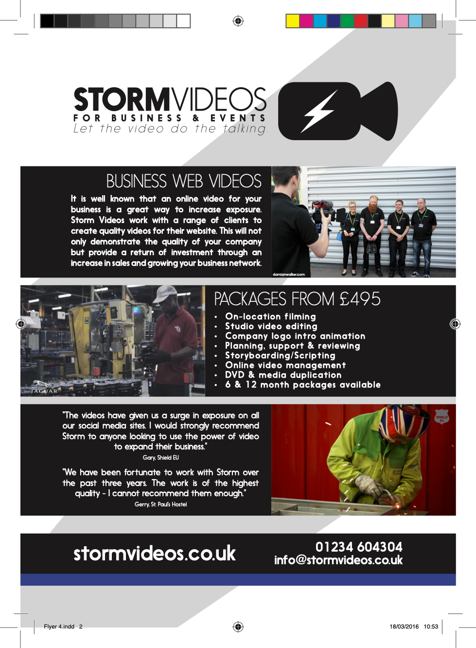

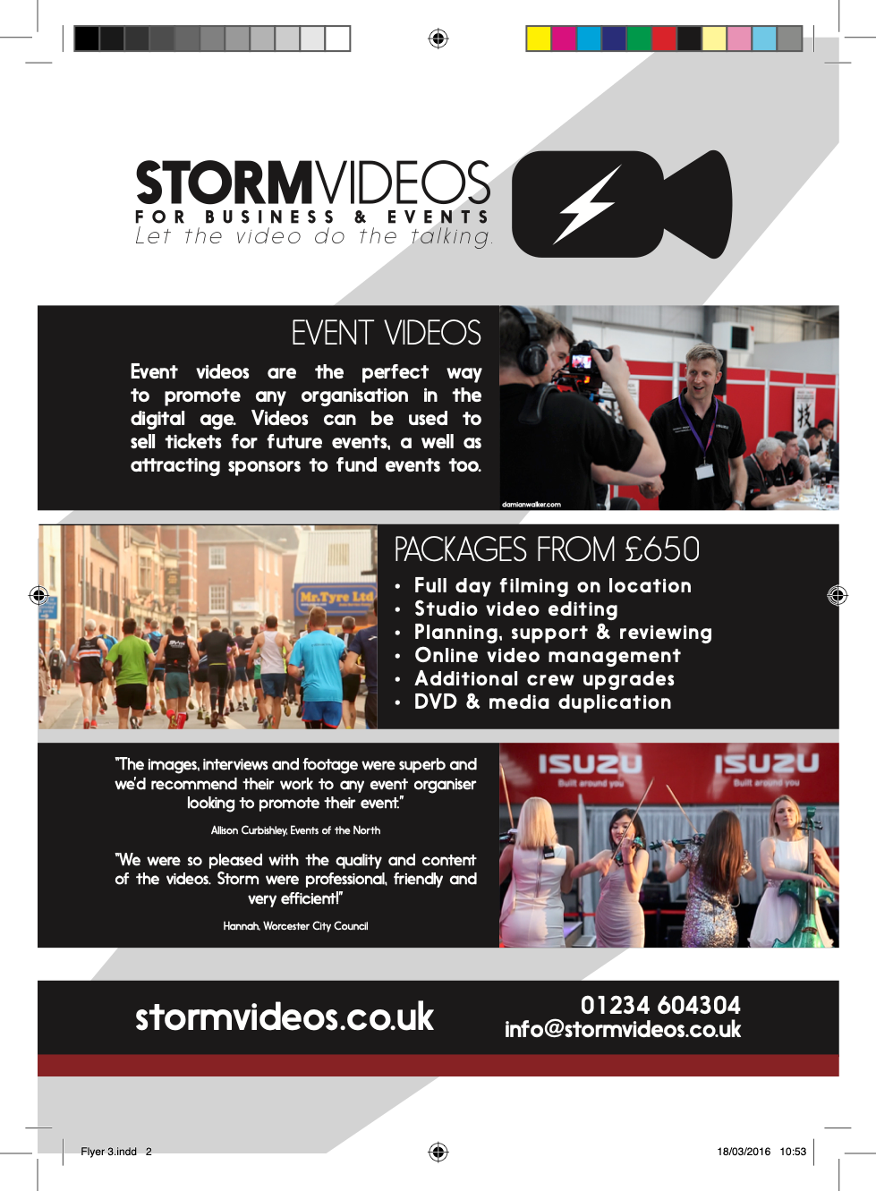
Two different leaflets the company wanted to deploy to their two main customer types. I added a colour stripe to the bottom so they could be quickly and easily distinguished for both customers and the business when displaying them.