This project was made in collaboration with Jason Bolt.
By 2018, Twitch Plays Pokémon was a large operation. It had grown explosively from a small hobby to a hugely popular channel attracting thousands of people per day. It had not been built with a brand in mind, and was inconsistent and messy. A new branding style was needed.
Twitch Plays Pokémon had previously used a bitmap font from one of the Nintendo DS era Pokémon games. While this was theme-appropriate, the text was only easily viewable at set point sizes and would become unreadable when scaled or viewed at lower quality.
I selected Acumin Condensed for its replacement, as I believed it kept the overall style of the previous font while being easily viewable at multiple scales, screen resolutions and worked well on both visual and static graphics.
The challenge was working with a "live" broadcast. The design needed to be able to convey a large amount of information consistently and constantly. It also needed to flexible enough to be used in promotional material for the stream and branding of the stream channel itself.
We created it in a "modular" format, with common elements that could be deployed depending on the situation.

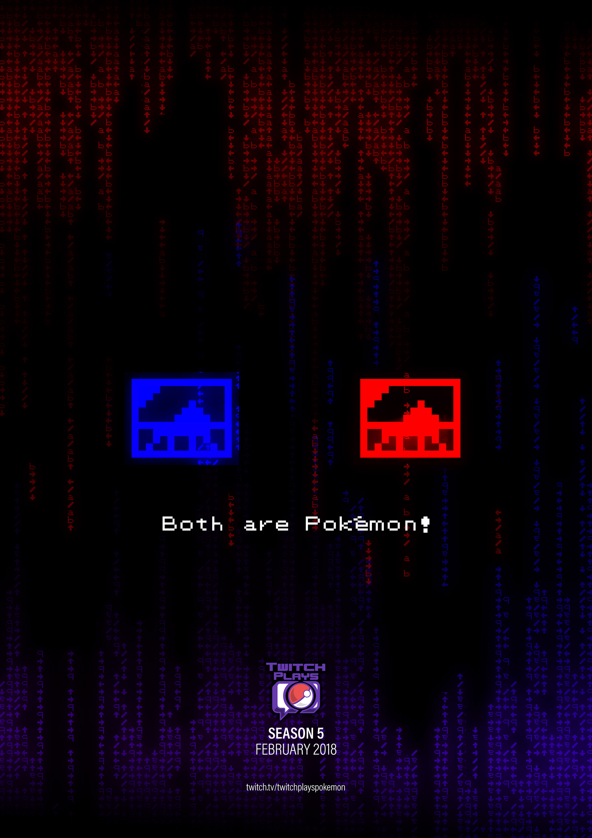
A promotional poster for Season 5, hinting at an event that played two versions of the Pokémon games at the same time in competition with each other. The poster uses the "command waterfall" iconic to the stream to illustrate the two sides fighting, with the posters and captions taken from two sets of posters featured in the games.

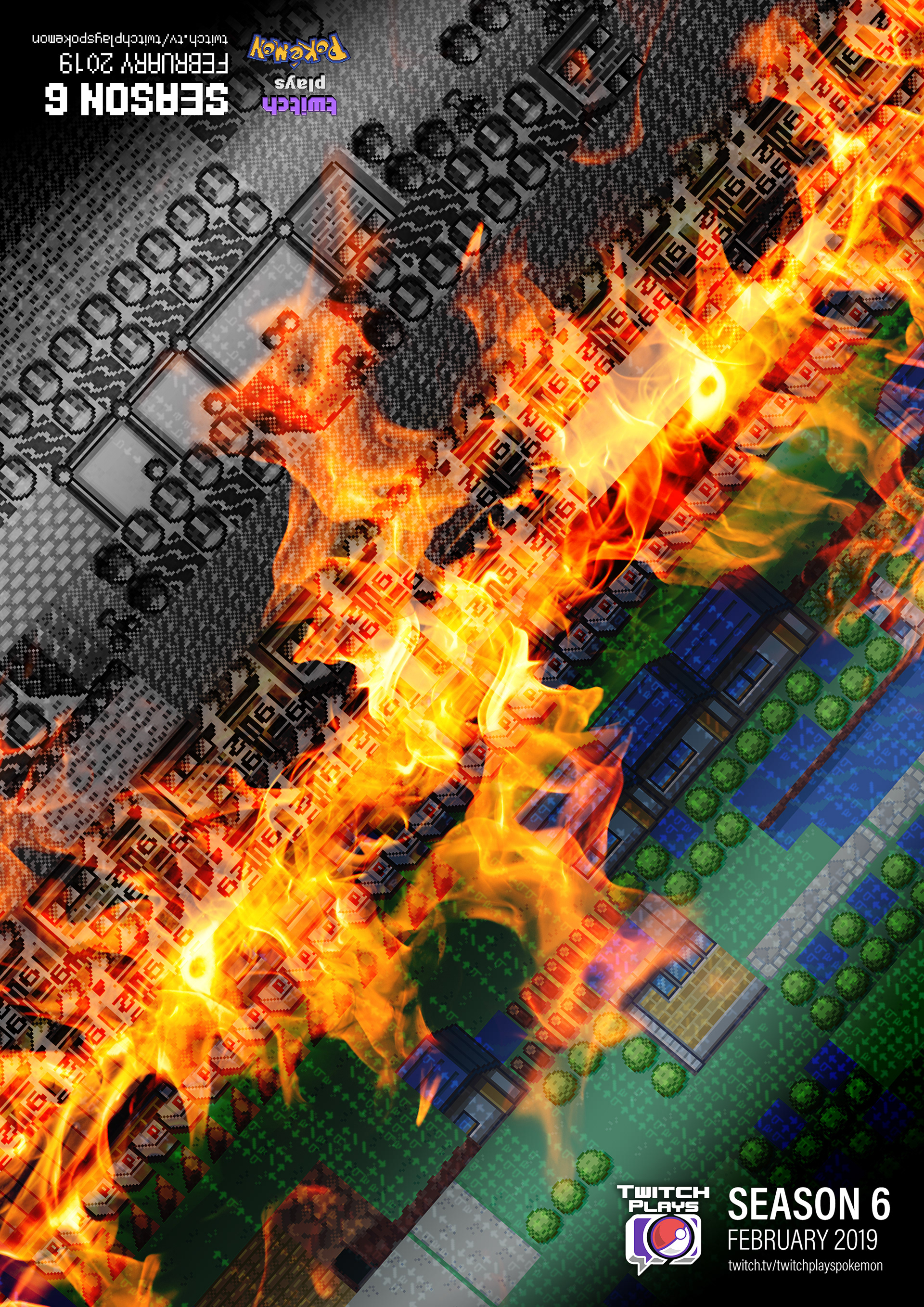
A promotional poster for Season 6, hinting at an event that switched between two games, old and new. For this, I created the poster so it could be viewed from either way up, with the old branding style and logo used for the old game and the new branding style on the new game.

The previous layout was very text-heavy and could be confusing and overwhelming to viewers. We tried to present information visually, using easily recognisable symbols, icons and diagrams in place of words.
We also came up with new ideas for the stream during design, such as a "post of the week" section which would showcase a selected community post or artwork on the stream. This was in an effort to bring together the social media and stream community.
We created a document with the channel's new overlay and branding design, explaining the principles and reasoning behind the elements and direction we took. It was presented to the community and received a positive response.

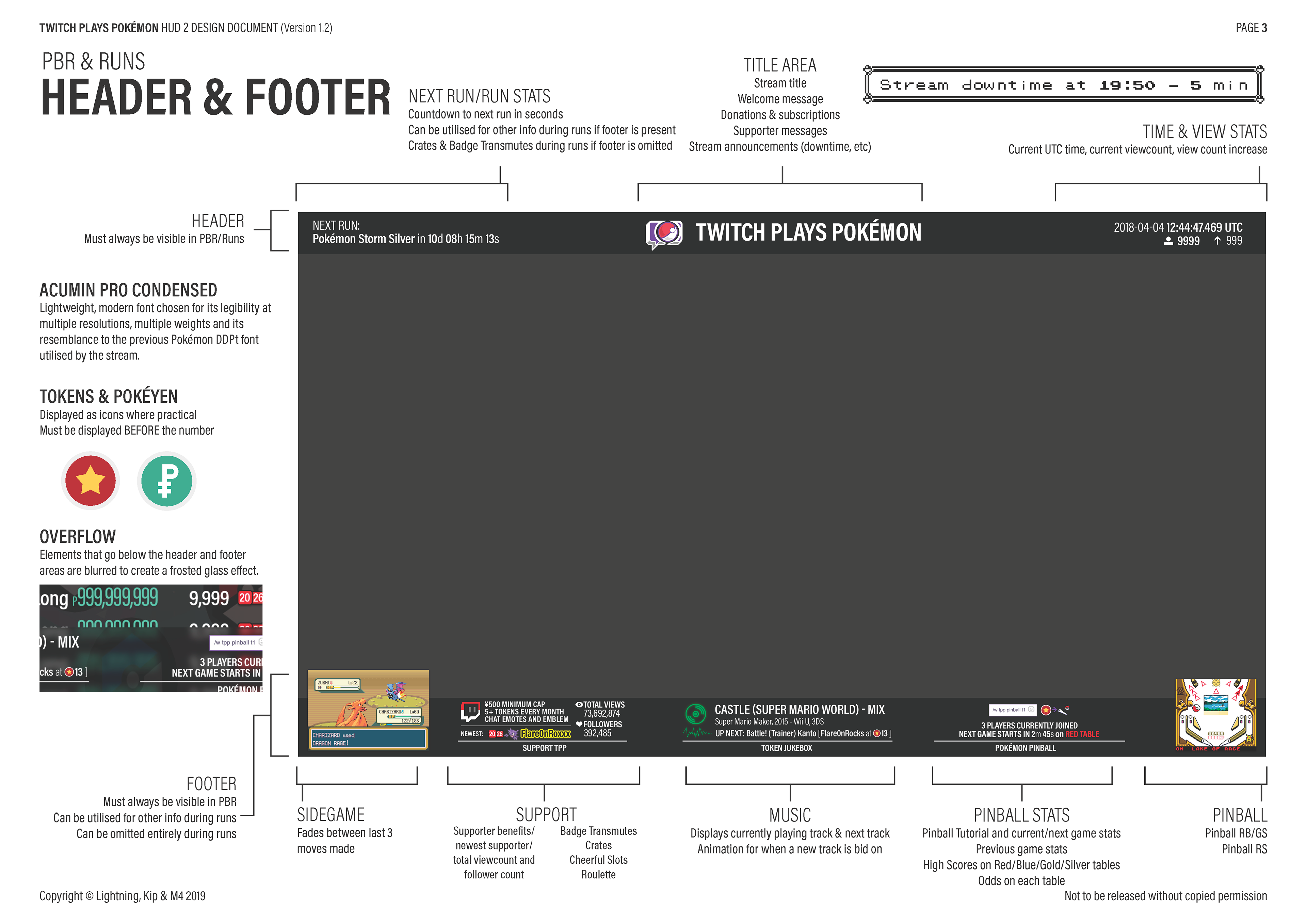
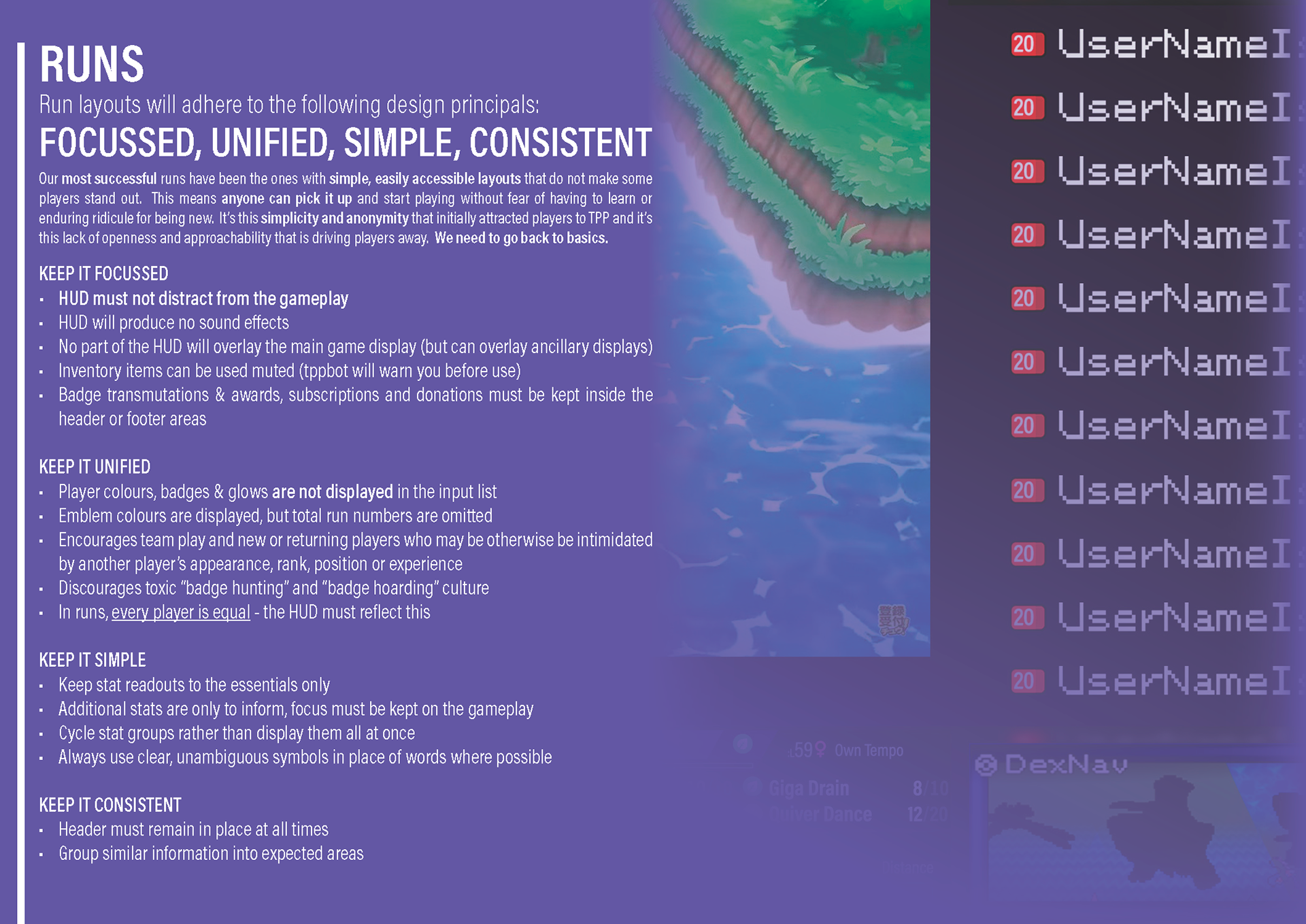
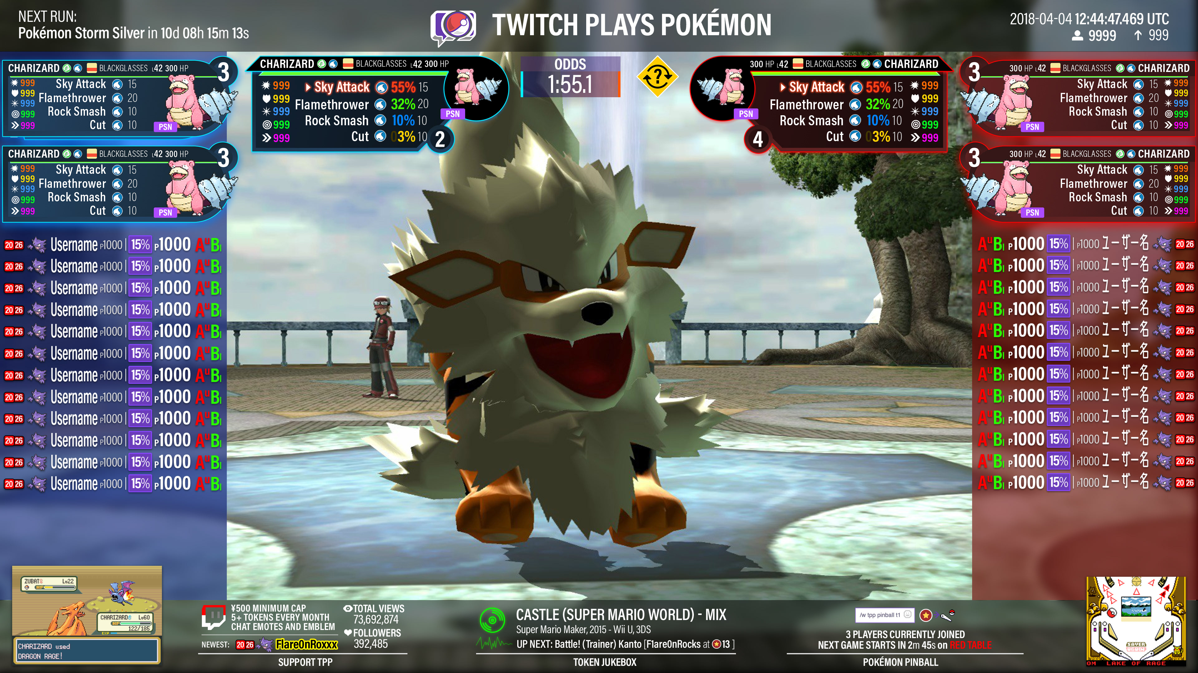
An example of one of the layout on the channel's About page. This would dynamically change depending on what was being shown on the channel at the time. I developed a "swap" system to make it easy to deploy the desired modules of graphics.

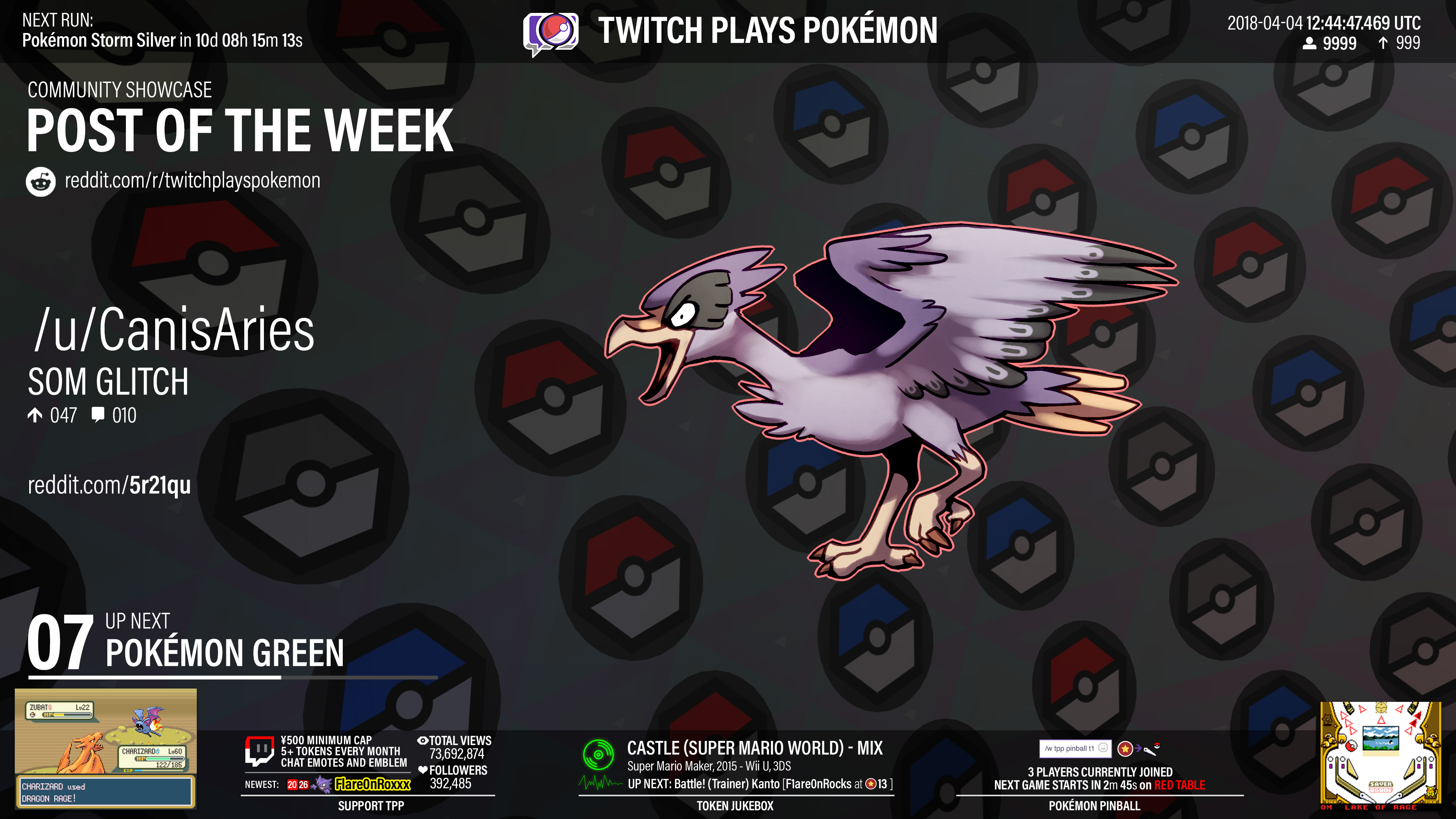
We tried to use symbols and images where possible in the channel's About page to help viewers less adept at reading large amounts of text. We had to design these to work dynamically on both dark and light backgrounds.

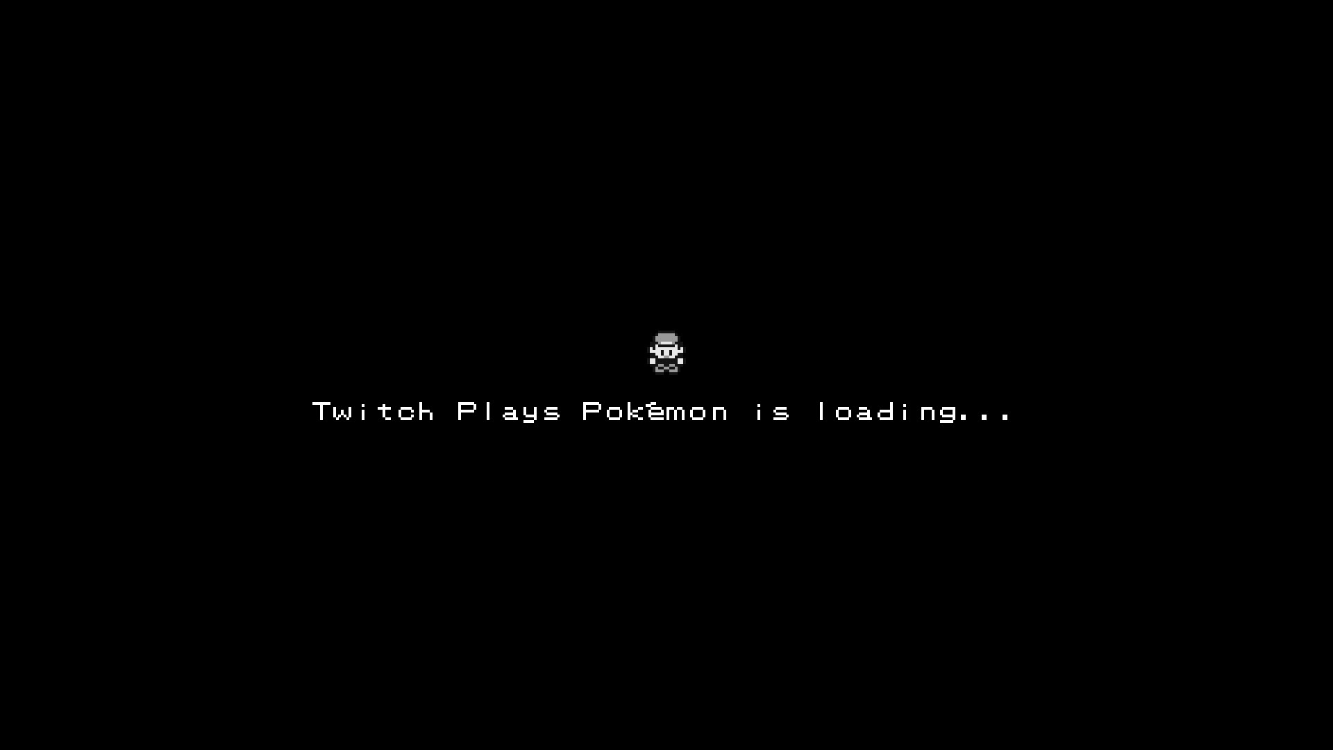
I designed and animated a Twitch Plays Pokémon ident to play at the start of every hour after the advert break. It shows the Pokéball thrown onto the screen, fading in the rest of the logo. It uses some of the iconic sound effects found in the classic Pokémon games.

I created a full animated series of screens to show when the channel was loading or temporarily down for maintenance. The message alternated between multiple languages and English to represent the global nature of the community.
Maps from the Pokémon games would be displayed in the background, animated to give the viewer the sense that they were travelling through them. Small Easter egg animations, featuring characters from previous seasons, would occasionally appear on-screen.

You may also like

Back to Top